You may have seen the news last week, we are delighted to announce the rebrand of Coadjute, providing a new robust, mould-breaking, and vibrant approach that will propel the company into its next stage of growth. For the Marketing team here at Coadjute, we were excited to take on such an important project, and the results have defied even our own humble expectations.
We caught up with CMO Dominique Summers and Head of Content and Digital Hugh Davey, to get the lowdown on all the ins and outs of navigating this rebrand. While not their first, it was a first for Coadjute since its launch in 2018, and by far the largest brand initiative they'd worked on to date for the company. Discussing the work, they provide their insight on the rewarding opportunity for collaboration, not only with their key Coadjute stakeholders, but likewise graphic designers, and a brand agency, which was both exciting and rewarding.
Why put yourself and the company through a rebrand?
Coadjute has had largely the same branding since it launched in 2018, with the same colours and styles. As the Coadjute product developed, and the thinking behind the strategy with it, the need for a refreshed identity became evident. The shift from a company that acted as a utility for the whole property market to one that instead provides end-to-end services for estate agents presented our team with the familiar balancing act of honouring legacy while reflecting such significant progress. We set out to reflect our strategic shift without losing sight of the last few years of development.
What was the brief?
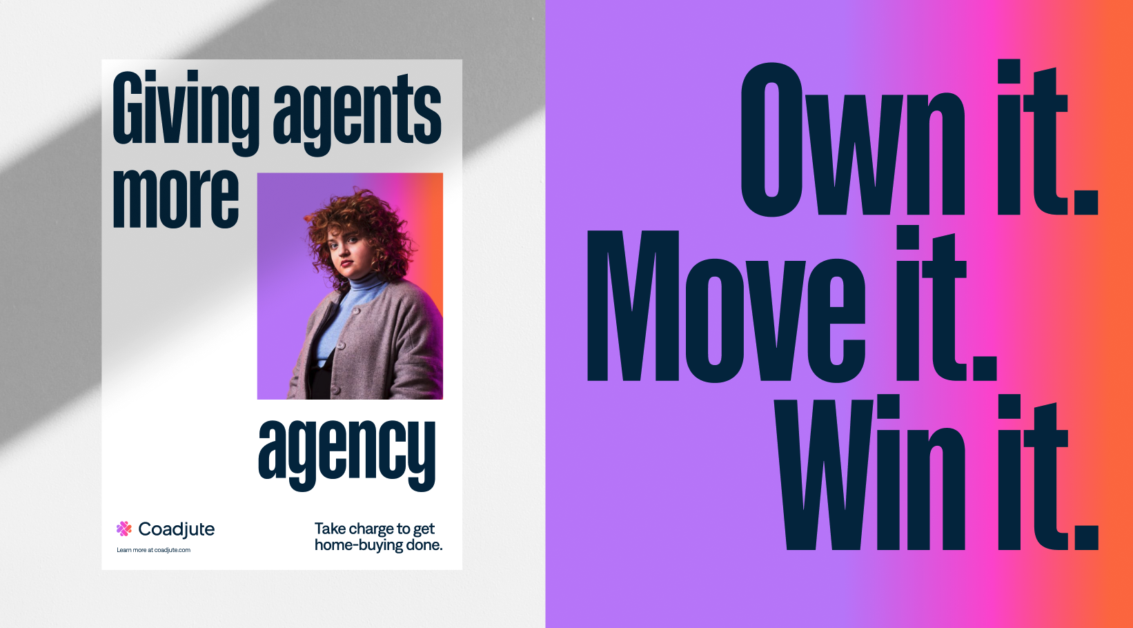
The updated brand needed to convey that estate agents were the heroes. Strategically, we realised that you can't focus on everyone equally if you are going to move the needle on improving transaction times. However, by empowering estate agents, serving their needs brilliantly would not only improve things for them but everyone involved as well. As a result the new brand had to reflect this key shift.
Where do you start on a rebrand project?
You begin by surveying the team on their thinking and vision for the brand (that was still in its infancy at this stage), then you conduct extensive research into existing brands that fit the vision, to understand what we liked and disliked. Then came draft examples based on themes which included moodboards and visual elements to help capture what our new brand could look like.
Was there an 'aha moment' when you knew the direction was right?
There really was. We knew we wanted the new brand to be a big departure from what we had before, otherwise what was the point? During this initial phase there was one theme that stood out for us, that of 'Empowering Estate Agents'. Big bold use of colour and gradients, powerful fonts, photography that really championed estate agents, it wasn't like anything else we'd seen in the industry. There was certainly a sense of trepidation about taking such a bold shift in the beginning, but as it started to develop this was when we got to really have fun with it and develop the essence of the brand and mould its personality.

The new brand empowers estate agents.
How did you decide the colour palette and the fonts?
One of our brand principles is "vibrant" so this had to be a cornerstone of the colour palette going forward. We felt our existing colours didn't reach this threshold of our principals, whereas now our colour palette is rich and vibrant, reflecting the spirit of Coadjute. The gradient is the cherry on top which boldly reinforces the brand's confidence and core theme of empowerment.
Palette and fonts in action.
Not only do we look different, we sound different too. Our words match our desire to empower our audiences and our new voice is amplified with our new fonts, Denim and Kaneda Gothic. Again these had to be bold, a typeface that would confidently reinforce the empowering feeling of using Coadjute, as well as bringing gravitas to the brand. In our hero font Kaneda Gothic we find a balance between assurance and approachability, whose bold silhouette interplays with the layout and brings a playful feel to our messaging. Partnered with Denim as our copy font, its fresh, innovative style compliments Kaneda Gothic wonderfully, bringing a clean feel to brand communications.
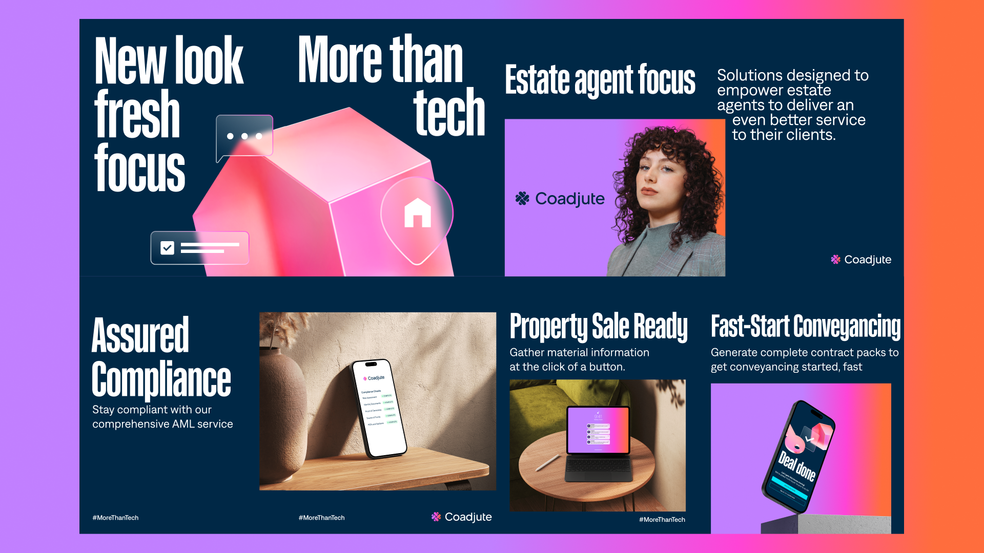
A new look and feel.
Your logo hasn't changed that much, was that a surprise?
As we went through the brand project nothing was off the table, including changing the logo. We spent a lot of time trying different alternatives but found that nothing landed in the same way our existing logo did. In the end slightly updating the logo to a more modern wordmark and the symbol to include the gradient was powerful enough. The new logo is instantly recognisable, building on the existing brand's equity, while transforming it inline with the new brand identity.
The new Coadjute logo.
What was your favourite part of the project?
Creatively speaking, it's the satisfaction that comes from starting with a feeling and channeling that through the whole process and seeing it turn into the finished article. We knew what we wanted to achieve, it was just a case of how we were going to get there, and once we landed on 'empowering' being the key theme it was thrilling to see what that feeling developed into. How the colours, fonts, and words all came together in their own unique way, to amplify the impact and articulate the story we were looking to tell was thrilling. You could really feel the energy and excitement building within the team as that initial feeling grew into what you can see today.
See the new brand in action across our website, or on our social channels.
